pacman::p_load(tidyverse, FunnelPlotR, plotly, knitr)Hands-on Exercise 4D - Funnel Plots for Fair Comparisons
1. Getting Started
1.1. Installing and launching packages
In this exercise, four R packages will be used. They are:
- readr for importing csv into R.
- FunnelPlotR for creating funnel plot.
- ggplot2 for creating funnel plot manually.
- knitr for building static html table. plotly for creating interactive funnel plot.
1.2. Importing data
In this section, COVID-19_DKI_Jakarta will be used.For this hands-on exercise, we are going to compare the cumulative COVID-19 cases and death by sub-district (i.e. kelurahan) as at 31st July 2021, DKI Jakarta.
The code chunk below imports the data into R and save it into a tibble data frame object called covid19.
covid19 <- read_csv("data/COVID-19_DKI_Jakarta.csv") %>%
  mutate_if(is.character, as.factor)
Rows: 267 Columns: 7
── Column specification ────────────────────────────────────────────────────────
Delimiter: ","
chr (3): City, District, Sub-district
dbl (4): Sub-district ID, Positive, Recovered, Death
ℹ Use `spec()` to retrieve the full column specification for this data.
ℹ Specify the column types or set `show_col_types = FALSE` to quiet this message.covid19# A tibble: 267 × 7
`Sub-district ID` City District `Sub-district` Positive Recovered Death
<dbl> <fct> <fct> <fct> <dbl> <dbl> <dbl>
1 3172051003 JAKARTA U… PADEMAN… ANCOL 1776 1691 26
2 3173041007 JAKARTA B… TAMBORA ANGKE 1783 1720 29
3 3175041005 JAKARTA T… KRAMAT … BALE KAMBANG 2049 1964 31
4 3175031003 JAKARTA T… JATINEG… BALI MESTER 827 797 13
5 3175101006 JAKARTA T… CIPAYUNG BAMBU APUS 2866 2792 27
6 3174031002 JAKARTA S… MAMPANG… BANGKA 1828 1757 26
7 3175051002 JAKARTA T… PASAR R… BARU 2541 2433 37
8 3175041004 JAKARTA T… KRAMAT … BATU AMPAR 3608 3445 68
9 3171071002 JAKARTA P… TANAH A… BENDUNGAN HIL… 2012 1937 38
10 3175031002 JAKARTA T… JATINEG… BIDARA CINA 2900 2773 52
# ℹ 257 more rows2. FunnelPlotR methods
FunnelPlotR package uses ggplot to generate funnel plots. It requires a numerator (events of interest), denominator (population to be considered) and group. The key arguments selected for customisation are:
- limit: plot limits (95 or 99).
- label_outliers: to label outliers (true or false).
- Poisson_limits: to add Poisson limits to the plot.
- OD_adjust: to add overdispersed limits to the plot.
- xrange and yrange: to specify the range to display for axes, acts like a zoom function.
- Other aesthetic components such as graph title, axis labels etc.
2.1. FunnelPlotR methods: The basic plot
funnel_plot(
  .data = covid19,
  numerator = Positive,
  denominator = Death,
  group = `Sub-district`
)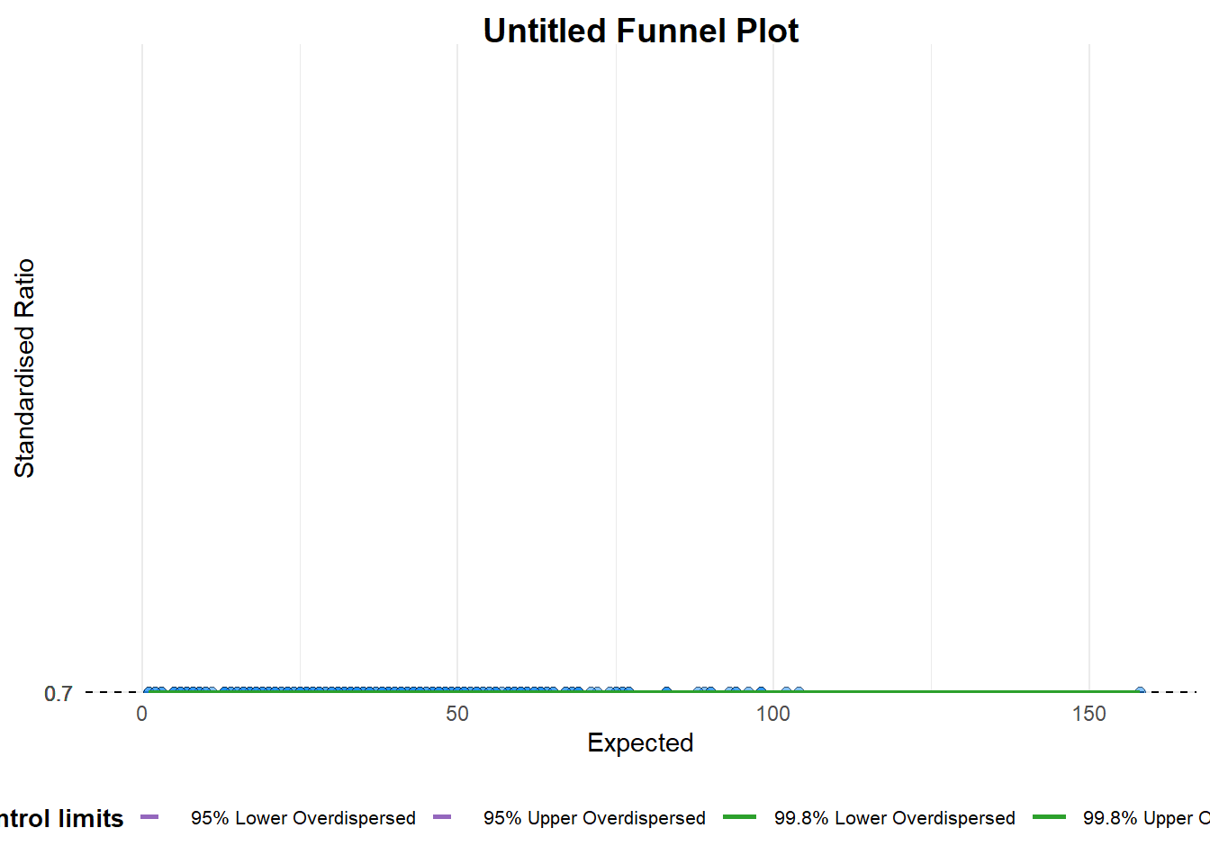
A funnel plot object with 267 points of which 0 are outliers.
Plot is adjusted for overdispersion.
A funnel plot object with 267 points of which 0 are outliers. Plot is adjusted for overdispersion.
Things to learn from the code chunk above. - group in this function is different from the scatterplot. Here, it defines the level of the points to be plotted i.e. Sub-district, District or City. If Cityc is chosen, there are only six data points. - By default, data_typeargument is “SR”. - limit: Plot limits, accepted values are: 95 or 99, corresponding to 95% or 99.8% quantiles of the distribution.
2.2. FunnelPlotR methods: Makeover 1
funnel_plot(
  .data = covid19,
  numerator = Death,
  denominator = Positive,
  group = `Sub-district`,
  data_type = "PR",     #<<
  xrange = c(0, 6500),  #<<
  yrange = c(0, 0.05)   #<<
)
Warning: The `xrange` argument deprecated; please use the `x_range` argument
instead. For more options, see the help: `?funnel_plot`Warning: The `yrange` argument deprecated; please use the `y_range` argument
instead. For more options, see the help: `?funnel_plot`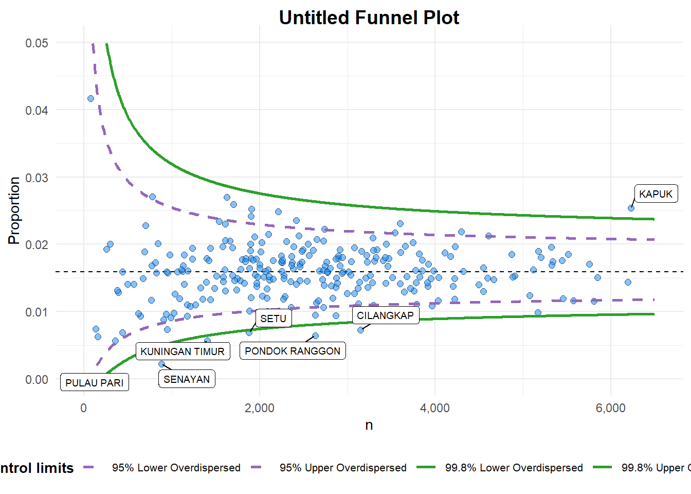
A funnel plot object with 267 points of which 7 are outliers.
Plot is adjusted for overdispersion.
A funnel plot object with 267 points of which 7 are outliers. Plot is adjusted for overdispersion.
Things to learn from the code chunk above. + data_type argument is used to change from default “SR” to “PR” (i.e. proportions). + xrange and yrange are used to set the range of x-axis and y-axis
2.3. FunnelPlotR methods: Makeover 2
funnel_plot(
  .data = covid19,
  numerator = Death,
  denominator = Positive,
  group = `Sub-district`,
  data_type = "PR",
  xrange = c(0, 6500),
  yrange = c(0, 0.05),
  label = NA,
  title = "Cumulative COVID-19 Fatality Rate by Cumulative Total Number of COVID-19 Positive Cases", #<<
  x_label = "Cumulative COVID-19 Positive Cases", #<<
  y_label = "Cumulative Fatality Rate"  #<<
)
Warning: The `xrange` argument deprecated; please use the `x_range` argument
instead. For more options, see the help: `?funnel_plot`Warning: The `yrange` argument deprecated; please use the `y_range` argument
instead. For more options, see the help: `?funnel_plot`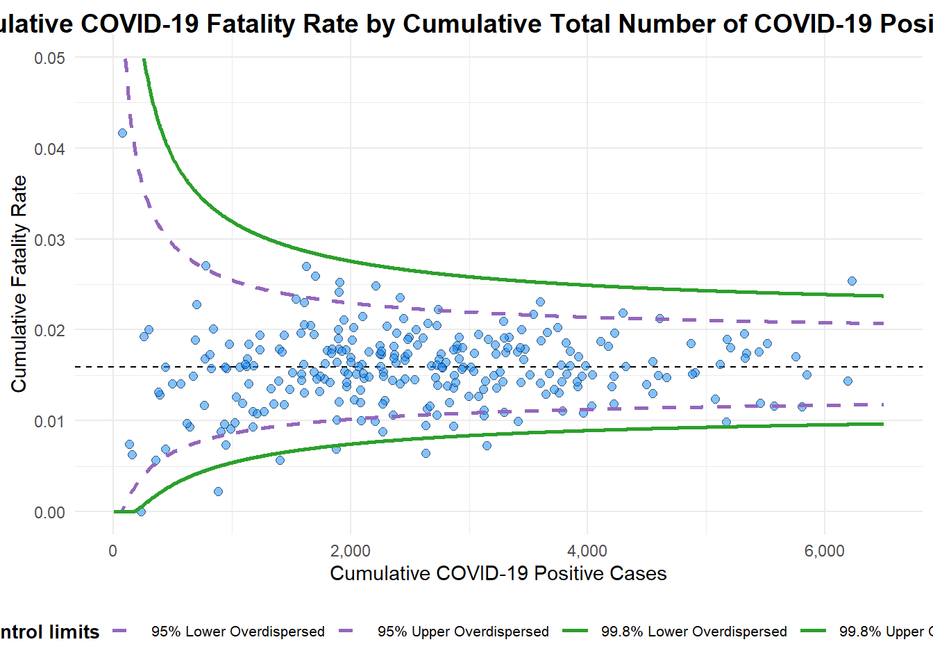
A funnel plot object with 267 points of which 7 are outliers.
Plot is adjusted for overdispersion.
3. Funnel Plot for Fair Visual Comparison: ggplot2 methods
3.1. Computing the basic derived fields
To plot the funnel plot from scratch, we need to derive cumulative death rate and standard error of cumulative death rate.
df <- covid19 %>%
  mutate(rate = Death / Positive) %>%
  mutate(rate.se = sqrt((rate*(1-rate)) / (Positive))) %>%
  filter(rate > 0)
Next, the fit.mean is computed by using the code chunk below.
fit.mean <- weighted.mean(df$rate, 1/df$rate.se^2)3.2. Calculate lower and upper limits for 95% and 99.9% CI
number.seq <- seq(1, max(df$Positive), 1)
number.ll95 <- fit.mean - 1.96 * sqrt((fit.mean*(1-fit.mean)) / (number.seq))
number.ul95 <- fit.mean + 1.96 * sqrt((fit.mean*(1-fit.mean)) / (number.seq))
number.ll999 <- fit.mean - 3.29 * sqrt((fit.mean*(1-fit.mean)) / (number.seq))
number.ul999 <- fit.mean + 3.29 * sqrt((fit.mean*(1-fit.mean)) / (number.seq))
dfCI <- data.frame(number.ll95, number.ul95, number.ll999,
                   number.ul999, number.seq, fit.mean)
3.3. Plotting a static funnel plot
p <- ggplot(df, aes(x = Positive, y = rate)) +
  geom_point(alpha = 0.4) +

  geom_line(data = dfCI,
            aes(x = number.seq,
                y = number.ll95),
            size = 0.4,
            colour = "grey40",
            linetype = "dashed") +
  geom_line(data = dfCI,
            aes(x = number.seq,
                y = number.ul95),
            size = 0.4,
            colour = "grey40",
            linetype = "dashed") +
  geom_line(data = dfCI,
            aes(x = number.seq,
                y = number.ll999),
            size = 0.4,
            colour = "grey40") +
  geom_line(data = dfCI,
            aes(x = number.seq,
                y = number.ul999),
            size = 0.4,
            colour = "grey40") +
  geom_hline(data = dfCI,
             aes(yintercept = fit.mean),
             size = 0.4,
             colour = "grey40") +
  coord_cartesian(ylim=c(0,0.05)) +
  annotate("text", x = 1, y = -0.13, label = "95%", size = 3, colour = "grey40") +
  annotate("text", x = 4.5, y = -0.18, label = "99%", size = 3, colour = "grey40") +
  ggtitle("Cumulative Fatality Rate by Cumulative Number of COVID-19 Cases") +
  xlab("Cumulative Number of COVID-19 Cases") +
  ylab("Cumulative Fatality Rate") +
  theme_light() +
  theme(plot.title = element_text(size=12),
        legend.position.inside = c(0.91,0.85),
        legend.title = element_text(size=7),
        legend.text = element_text(size=7),
        legend.background = element_rect(colour = "grey60", linetype = "dotted"),
        legend.key.height = unit(0.3, "cm"))
Warning: Using `size` aesthetic for lines was deprecated in ggplot2 3.4.0.
ℹ Please use `linewidth` instead.p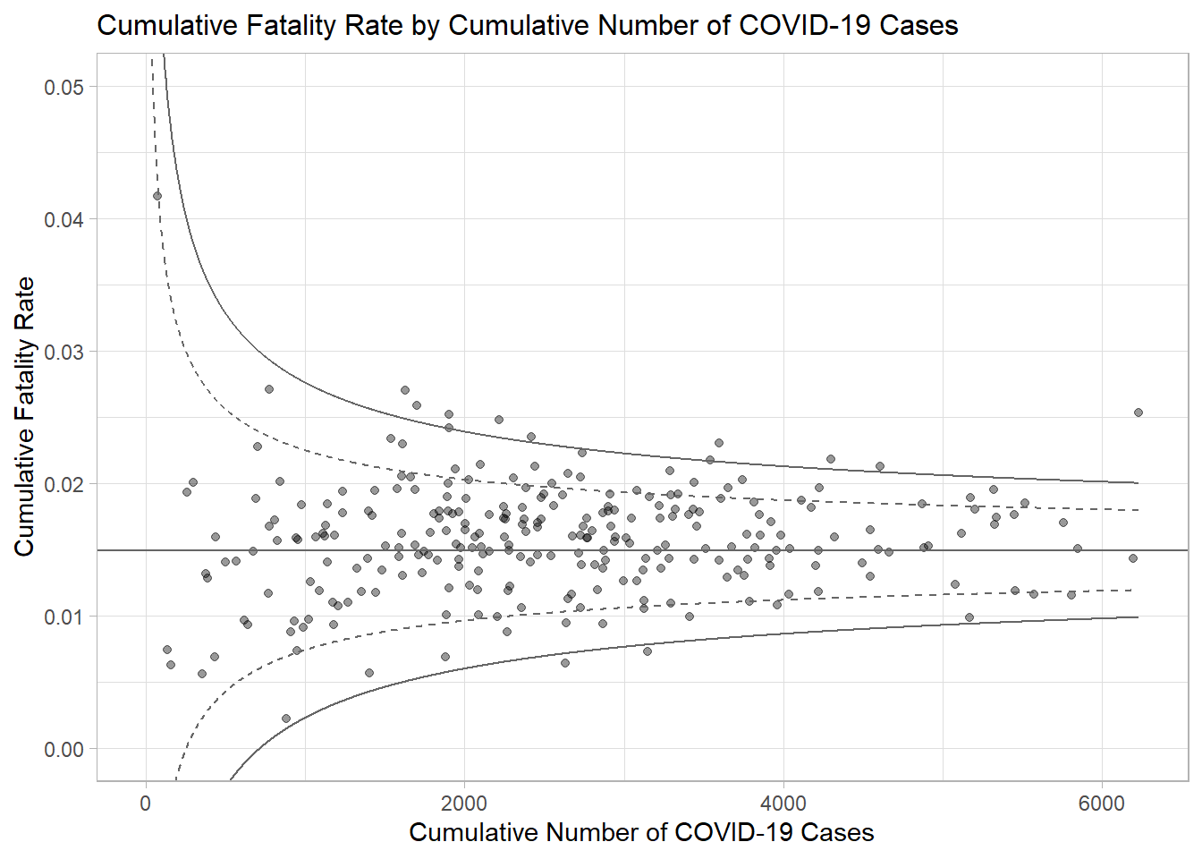
3.4. Interactive Funnel Plot: plotly + ggplot2
The funnel plot created using ggplot2 functions can be made interactive with ggplotly() of plotly r package.
fp_ggplotly <- ggplotly(p,
  tooltip = c("label",
              "x",
              "y"))
fp_ggplotly