pacman::p_load(ggrepel, patchwork,
               ggthemes, hrbrthemes,
tidyverse) Hands-on_Ex02
Getting Started
Install and loading required libraries
Importing data
exam_data <- read_csv("data/Exam_data_2.csv")Rows: 322 Columns: 7
── Column specification ────────────────────────────────────────────────────────
Delimiter: ","
chr (4): ID, CLASS, GENDER, RACE
dbl (3): ENGLISH, MATHS, SCIENCE
ℹ Use `spec()` to retrieve the full column specification for this data.
ℹ Specify the column types or set `show_col_types = FALSE` to quiet this message.Working with ggrepel
ggplot(data=exam_data,
       aes(x= MATHS,
           y=ENGLISH)) +
  geom_point() +
  geom_smooth(method=lm,
              size=0.5) +
  geom_label(aes(label = ID),
             hjust = .5,
             vjust = -.5) +
  coord_cartesian(xlim=c(0,100),
                  ylim=c(0,100)) +
  ggtitle("English scores versus Maths scores for Primary 3")
Warning: Using `size` aesthetic for lines was deprecated in ggplot2 3.4.0.
ℹ Please use `linewidth` instead.`geom_smooth()` using formula = 'y ~ x'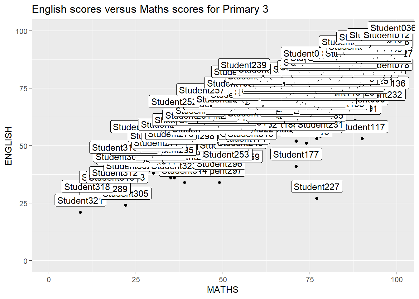
Alternate code to get rid of annotation
ggplot(data=exam_data,
       aes(x= MATHS,
           y=ENGLISH)) +
  geom_point() +
  geom_smooth(method=lm,
              size=0.5) +
  geom_label_repel(aes(label = ID),
                   fontface = "bold") +
  coord_cartesian(xlim=c(0,100),
                  ylim=c(0,100)) +
  ggtitle("English scores versus Maths scores for Primary 3")
`geom_smooth()` using formula = 'y ~ x'Warning: ggrepel: 317 unlabeled data points (too many overlaps). Consider
increasing max.overlaps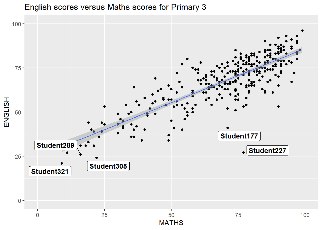
Beyond ggplot2 theme
ggplot(data=exam_data,
             aes(x = MATHS)) +
  geom_histogram(bins=20,
                 boundary = 100,
                 color="grey25",
                 fill="grey90") +
  theme_minimal() +
ggtitle("Distribution of Maths scores") 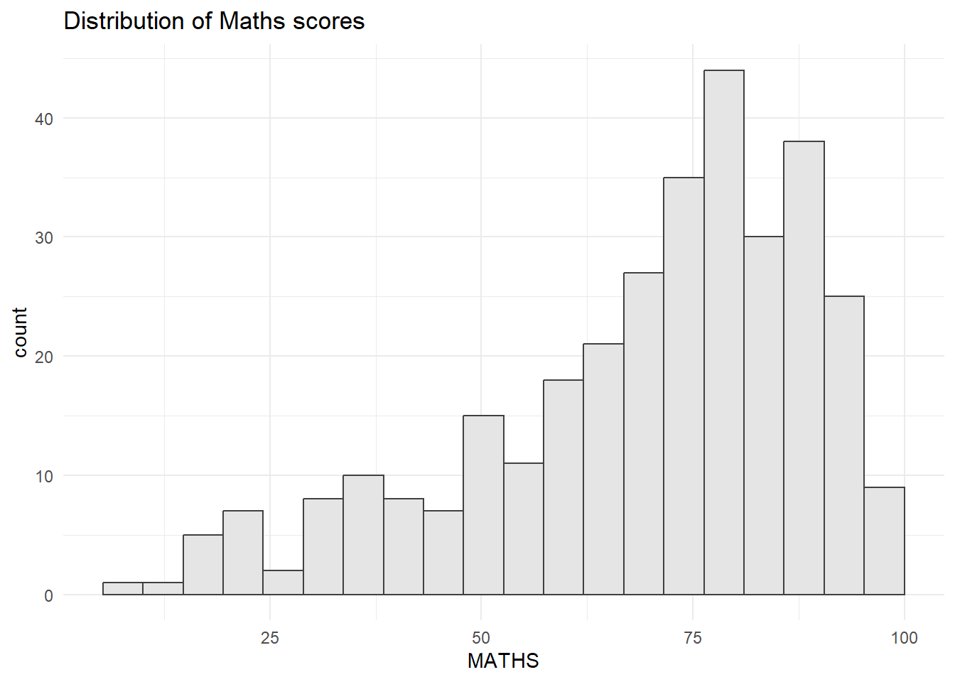
There are 8 built-in themes of ggplot2, which are: theme_gray(), theme_bw(), theme_classic(), theme_dark(), theme_light(), theme_linedraw(), theme_minimal(), and theme_void()
Working with ggtheme package
ggtheme offers an even wider variety of plotting styles, such as The Economist (theme_economist) or Stata (theme_stata)
ggplot(data=exam_data,
             aes(x = MATHS)) +
  geom_histogram(bins=20,
                 boundary = 100,
                 color="grey25",
                 fill="grey90") +
  ggtitle("Distribution of Maths scores") +
  theme_economist()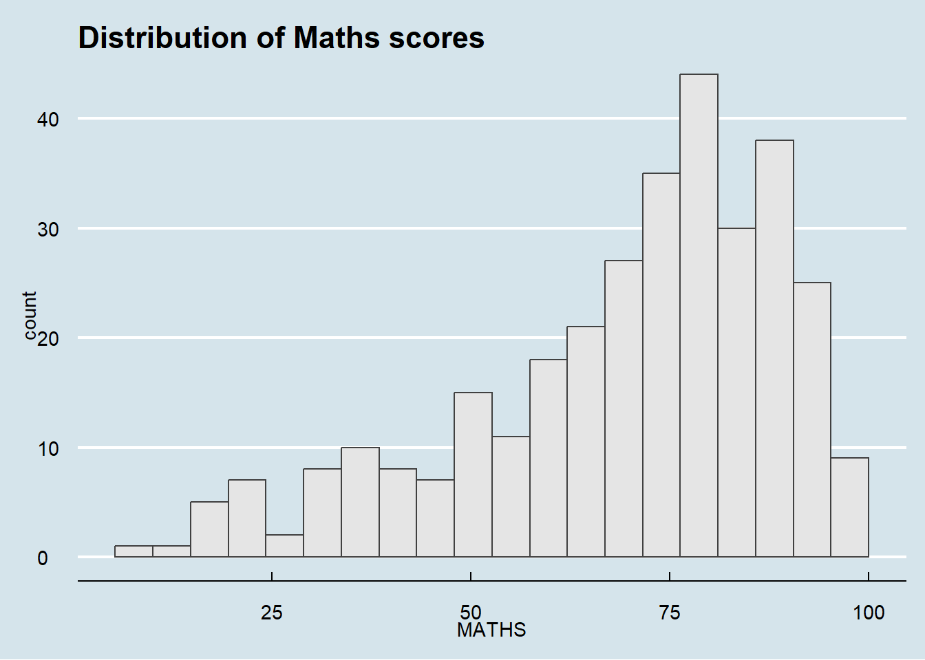
Working with hrbthems package
Working with hrbthemes package. Why use this package? It has 2 goals. First, it provides a base theme that focuses on typographic elements. Second, it centers around productivity for a production workflow
ggplot(data=exam_data,
             aes(x = MATHS)) +
  geom_histogram(bins=20,
                 boundary = 100,
                 color="grey25",
                 fill="grey90") +
  ggtitle("Distribution of Maths scores") +
  theme_ipsum()
Warning in grid.Call(C_stringMetric, as.graphicsAnnot(x$label)): font family
not found in Windows font database
Warning in grid.Call(C_stringMetric, as.graphicsAnnot(x$label)): font family
not found in Windows font database
Warning in grid.Call(C_stringMetric, as.graphicsAnnot(x$label)): font family
not found in Windows font databaseWarning in grid.Call(C_textBounds, as.graphicsAnnot(x$label), x$x, x$y, : font
family not found in Windows font database
Warning in grid.Call(C_textBounds, as.graphicsAnnot(x$label), x$x, x$y, : font
family not found in Windows font database
Warning in grid.Call(C_textBounds, as.graphicsAnnot(x$label), x$x, x$y, : font
family not found in Windows font databaseWarning in grid.Call.graphics(C_text, as.graphicsAnnot(x$label), x$x, x$y, :
font family not found in Windows font database
Warning in grid.Call.graphics(C_text, as.graphicsAnnot(x$label), x$x, x$y, :
font family not found in Windows font database
Warning in grid.Call.graphics(C_text, as.graphicsAnnot(x$label), x$x, x$y, :
font family not found in Windows font database
Warning in grid.Call.graphics(C_text, as.graphicsAnnot(x$label), x$x, x$y, :
font family not found in Windows font database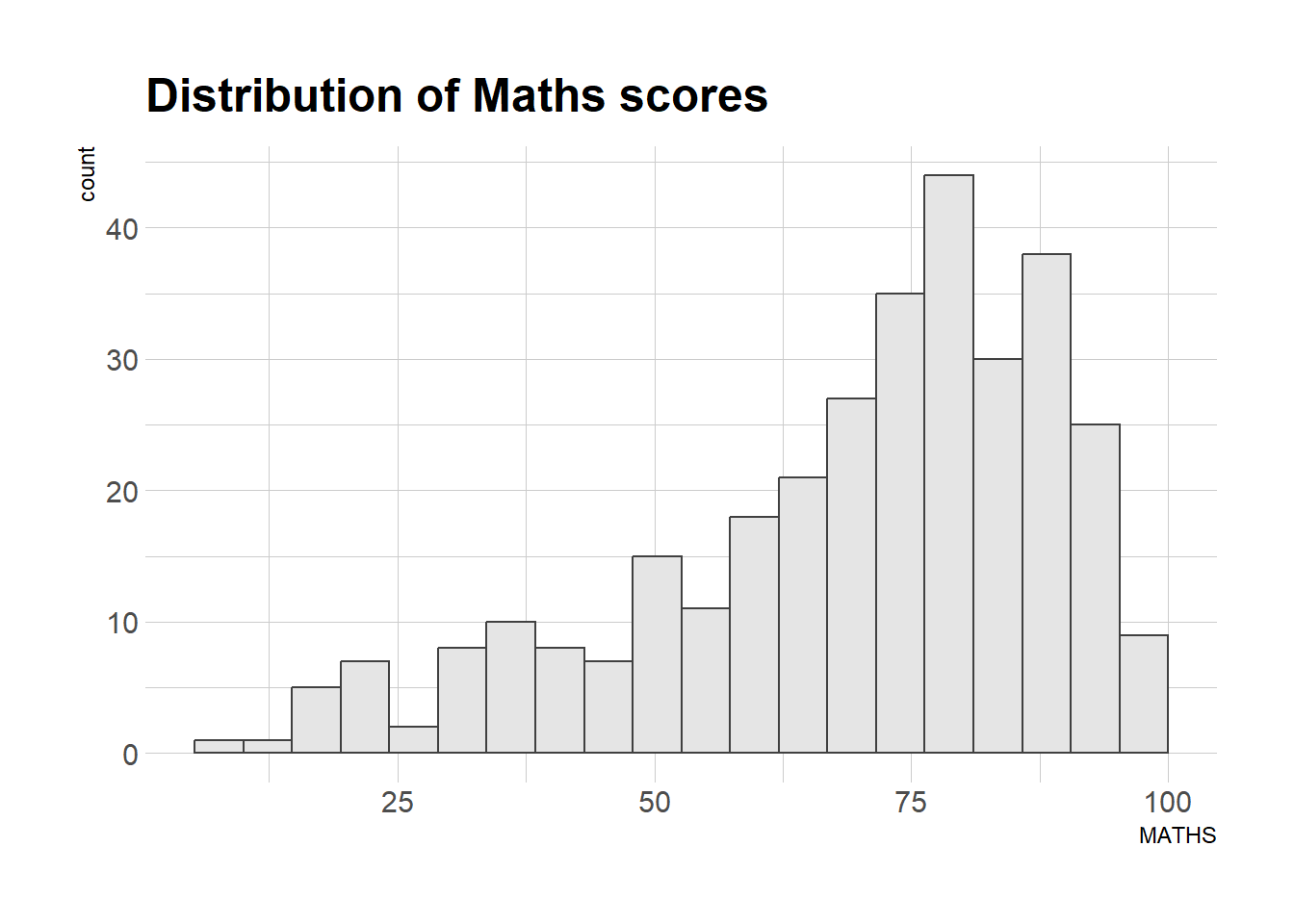
ggplot(data=exam_data,
             aes(x = MATHS)) +
  geom_histogram(bins=20,
                 boundary = 100,
                 color="grey25",
                 fill="grey90") +
  ggtitle("Distribution of Maths scores") +
  theme_ipsum(axis_title_size = 10,
              base_size = 10,
              grid = "Y")
Warning in grid.Call(C_stringMetric, as.graphicsAnnot(x$label)): font family
not found in Windows font databaseWarning in grid.Call(C_textBounds, as.graphicsAnnot(x$label), x$x, x$y, : font
family not found in Windows font database
Warning in grid.Call(C_textBounds, as.graphicsAnnot(x$label), x$x, x$y, : font
family not found in Windows font databaseWarning in grid.Call.graphics(C_text, as.graphicsAnnot(x$label), x$x, x$y, :
font family not found in Windows font database
Warning in grid.Call.graphics(C_text, as.graphicsAnnot(x$label), x$x, x$y, :
font family not found in Windows font database
Beyond single graphs
Graphing of Math scores
p1 <- ggplot(data=exam_data,
             aes(x = MATHS)) +
  geom_histogram(bins=20,
                 boundary = 100,
                 color="grey25",
                 fill="grey90") +
  coord_cartesian(xlim=c(0,100)) +
  ggtitle("Distribution of Maths scores")
print(p1)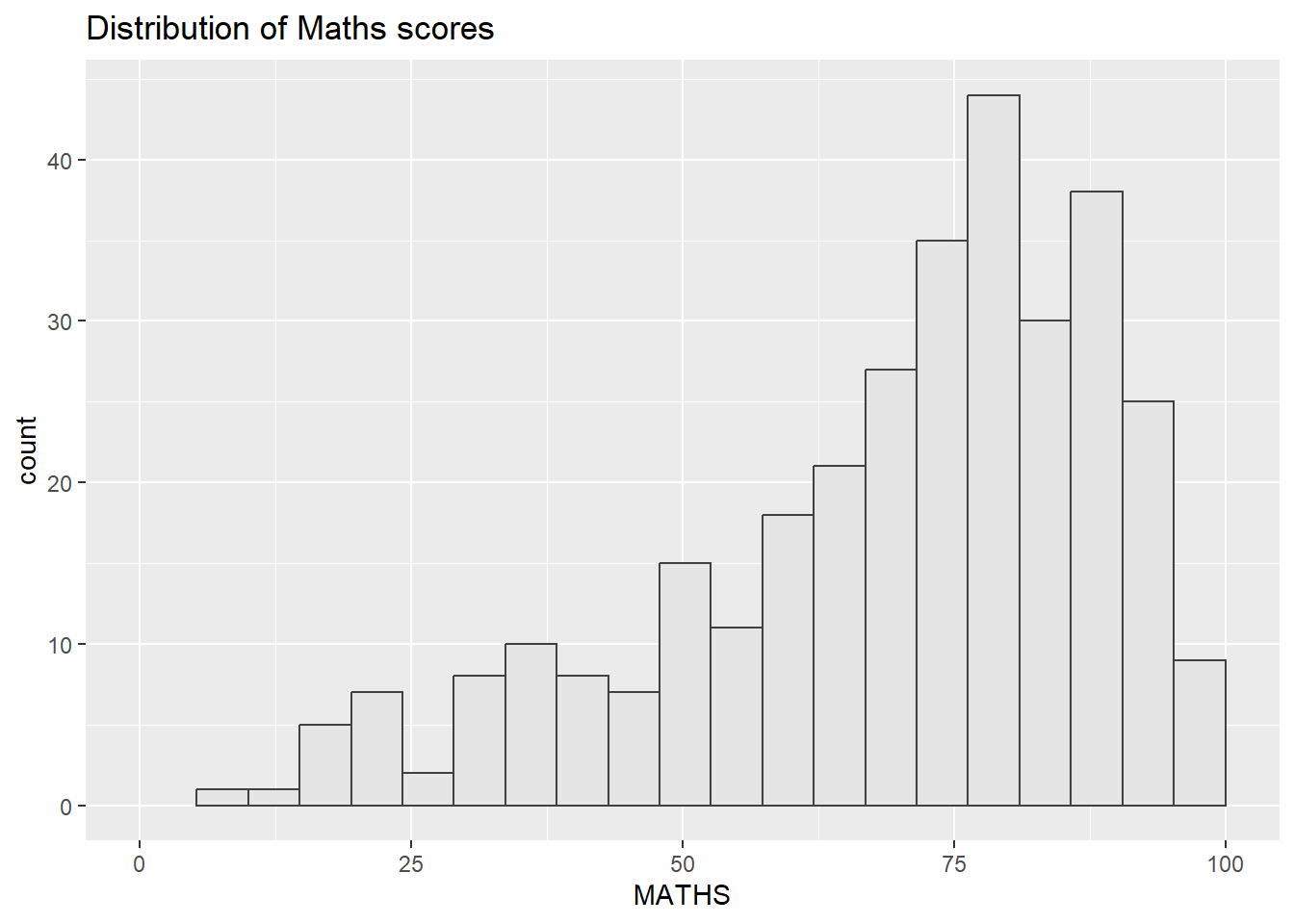
Graphing of English scores
p2 <- ggplot(data=exam_data,
             aes(x = ENGLISH)) +
  geom_histogram(bins=20,
                 boundary = 100,
                 color="grey25",
                 fill="grey90") +
  coord_cartesian(xlim=c(0,100)) +
  ggtitle("Distribution of English scores")
print(p2)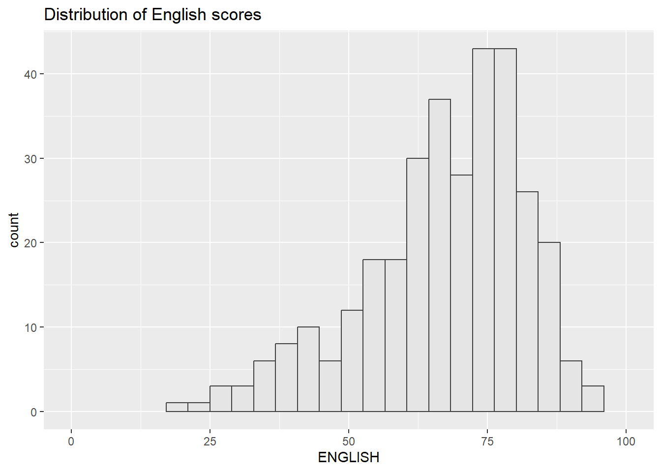
Graphing scatterplot for English score versus Maths score
p3 <- ggplot(data=exam_data,
             aes(x= MATHS,
                 y=ENGLISH)) +
  geom_point() +
  geom_smooth(method=lm,
              size=0.5) +
  coord_cartesian(xlim=c(0,100),
                  ylim=c(0,100)) +
  ggtitle("English scores versus Maths scores for Primary 3")
print(p3)
`geom_smooth()` using formula = 'y ~ x'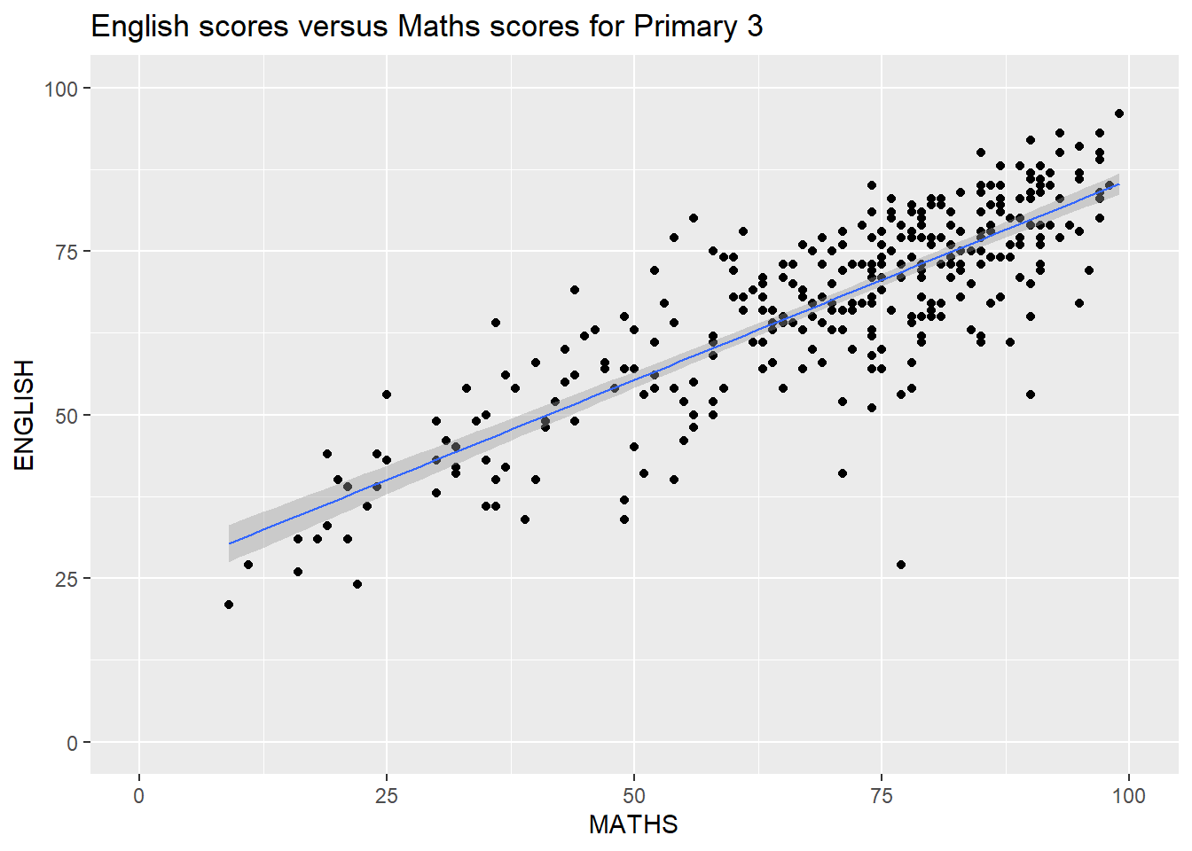
Using patchwork extension to create composite figures by combining graphs
install.packages(“devtools”)
library(patchwork)Combining 2 ggplot2 graphs
p1+p2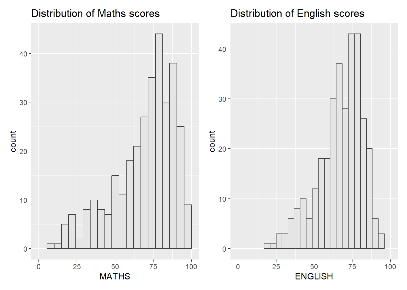
Additional attempt 1 : use different code to combine the 2 graphs
wrap_plots(p1,p2)
Combining 3 ggplot2 graphs
(p1 / p2) | p3`geom_smooth()` using formula = 'y ~ x'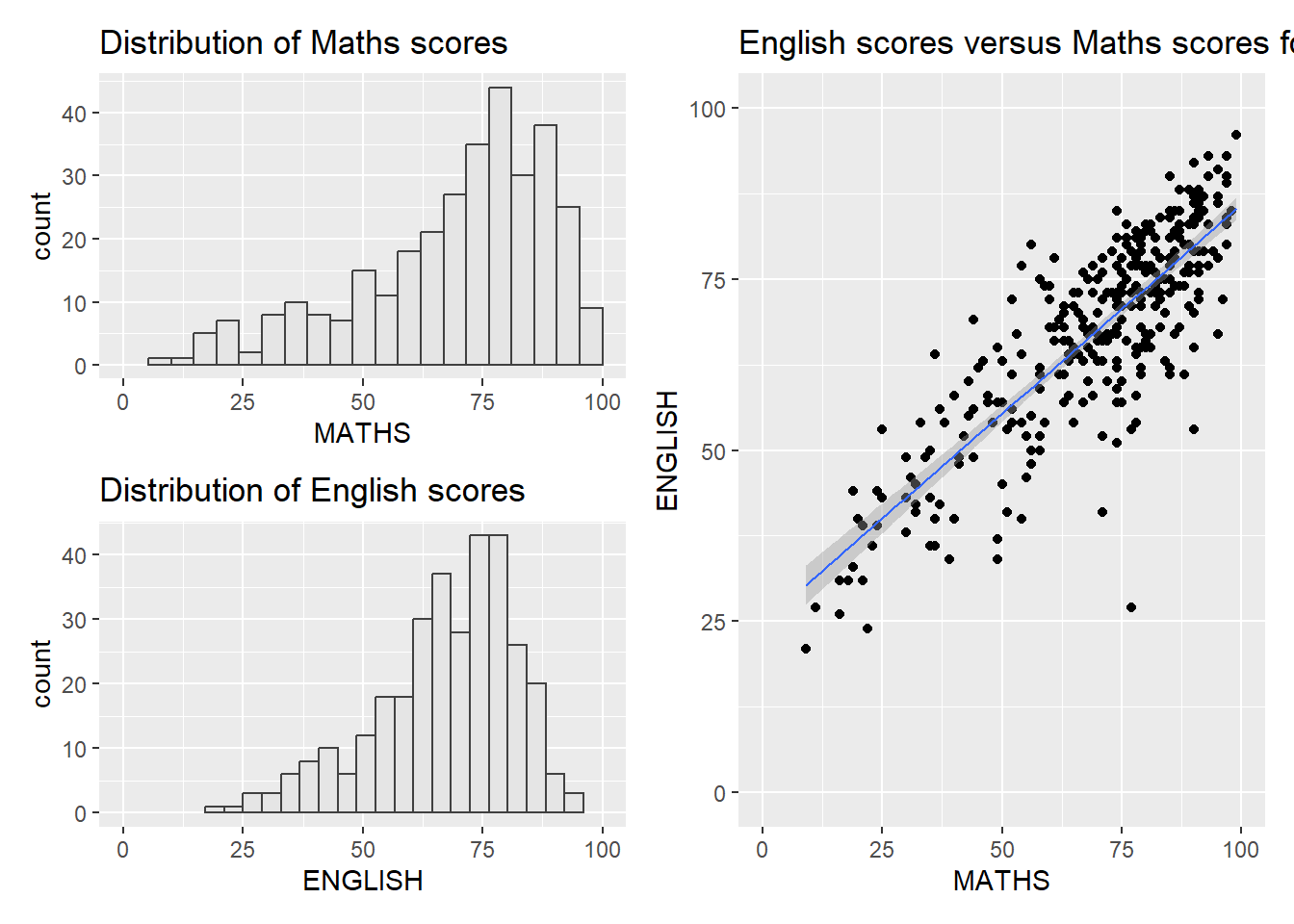
Additional attempt 2: Trying different style of stacking
(p1 | p2) / p3`geom_smooth()` using formula = 'y ~ x'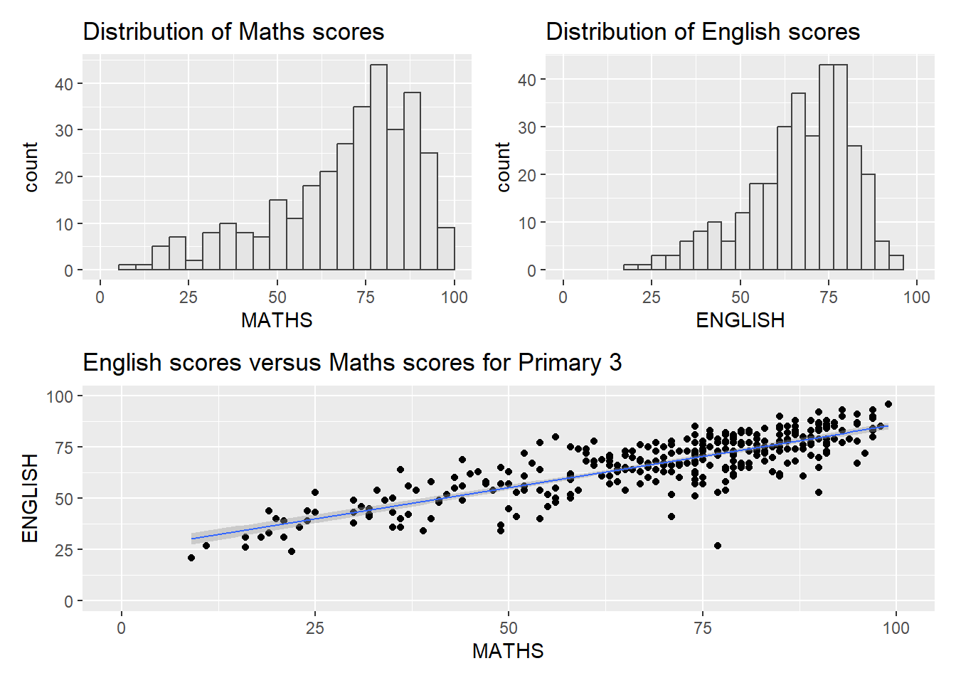
Creating a composite figure with tag
((p1 / p2) | p3) +
  plot_annotation(tag_levels = 'I')
`geom_smooth()` using formula = 'y ~ x'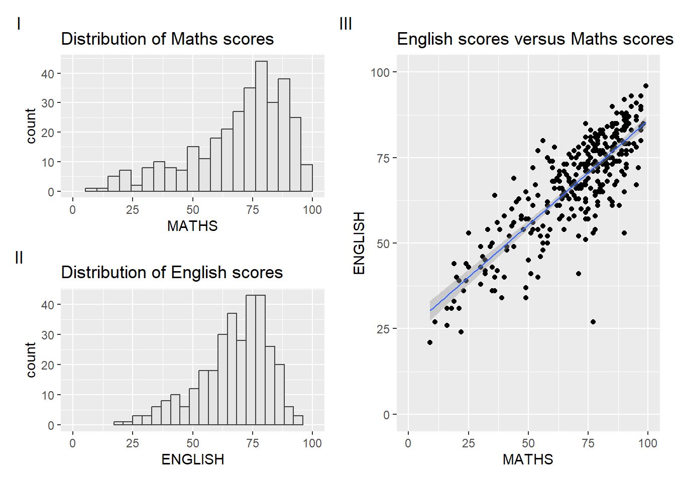
Additional attempt 3: Trying to make it more beautiful
(p1 | p2) / p3 +
  plot_annotation(tag_levels = 'I') &
  theme(plot.tag = element_text(size = 10))
`geom_smooth()` using formula = 'y ~ x'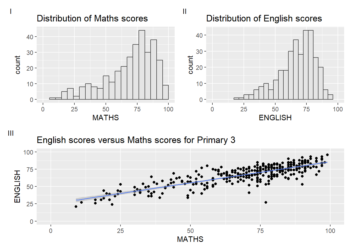
Creating figure with insert
p3 + inset_element(p2,
                   left = 0.01,
                   bottom = 0.7,
                   right = 0.5,
                   top = 1)
`geom_smooth()` using formula = 'y ~ x'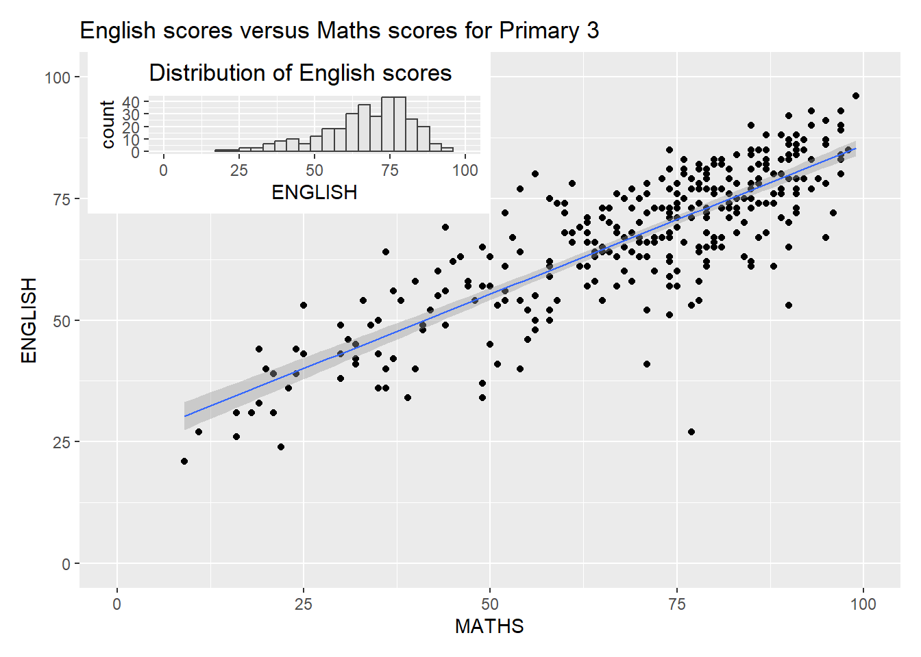
Additional attempt 4:
p2_density <- ggplot(exam_data, aes(x = ENGLISH)) +
  geom_density(fill = "#EEDFCC", alpha = 0.5) +
  ggtitle("English score density") +
  theme_minimal(base_size = 8) +
  theme(
    axis.title = element_blank(),
    axis.text = element_blank(),
    axis.ticks = element_blank(),
    panel.grid = element_blank(),
    #plot.title = element_blank(),
    panel.border = element_rect(color = "black", fill = NA, linewidth = 0.3)
  )
print (p2_density)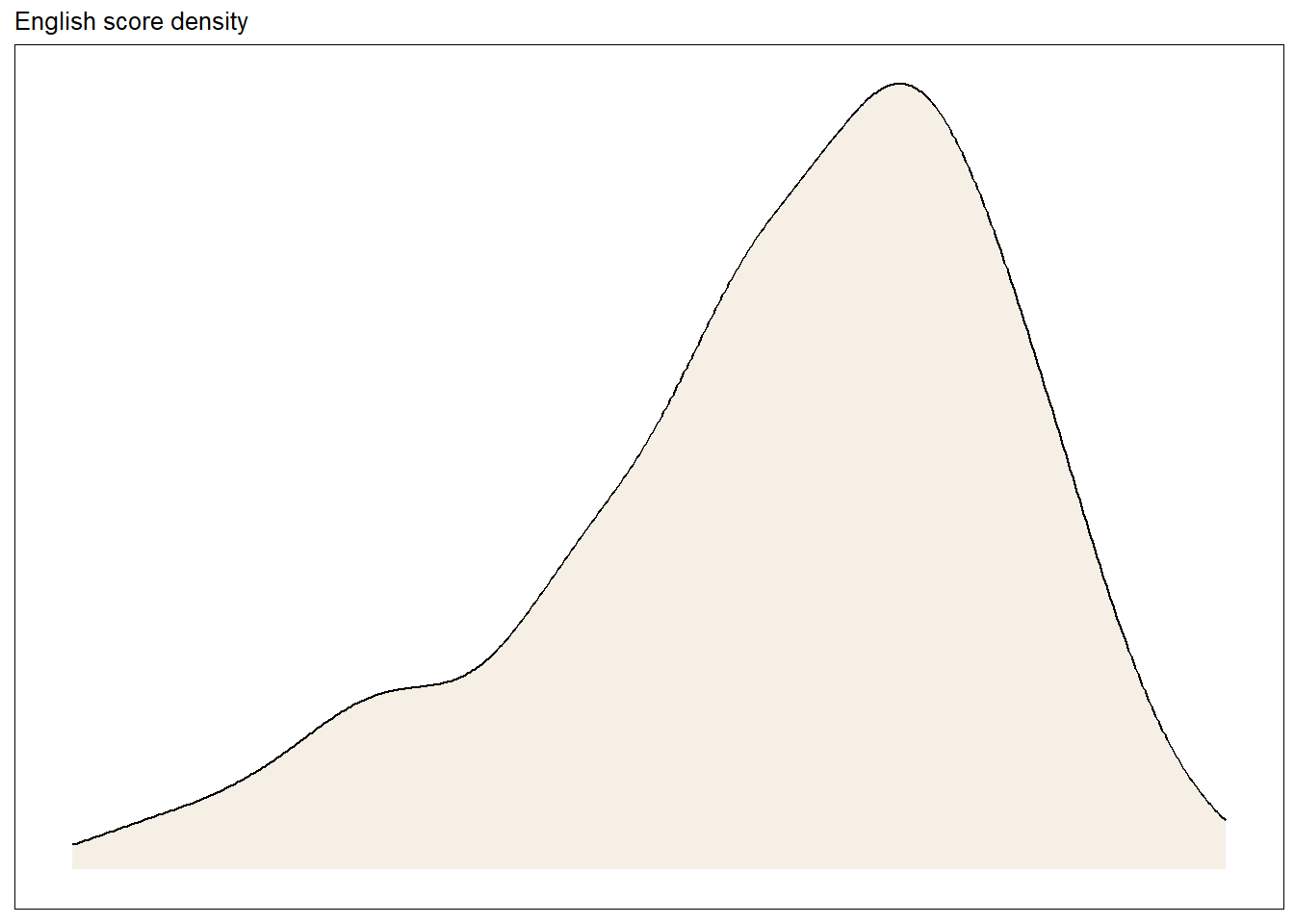
p3 + inset_element(
  p2_density,
  left = 0.01, bottom = 0.7,
  right = 0.5, top = 1
)
`geom_smooth()` using formula = 'y ~ x'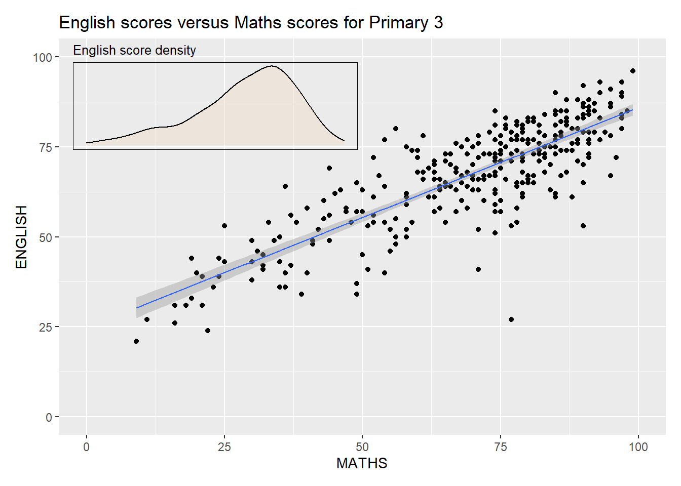
Creating a composite figure by using patchwork and ggtheme combined
patchwork <- (p1 / p2) | p3
patchwork & theme_economist()
`geom_smooth()` using formula = 'y ~ x'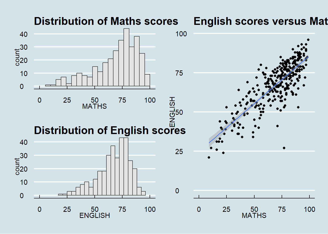
Additional attempt 5a:
patchwork <- (p1 | p2) / p3
patchwork & theme_bw()
`geom_smooth()` using formula = 'y ~ x'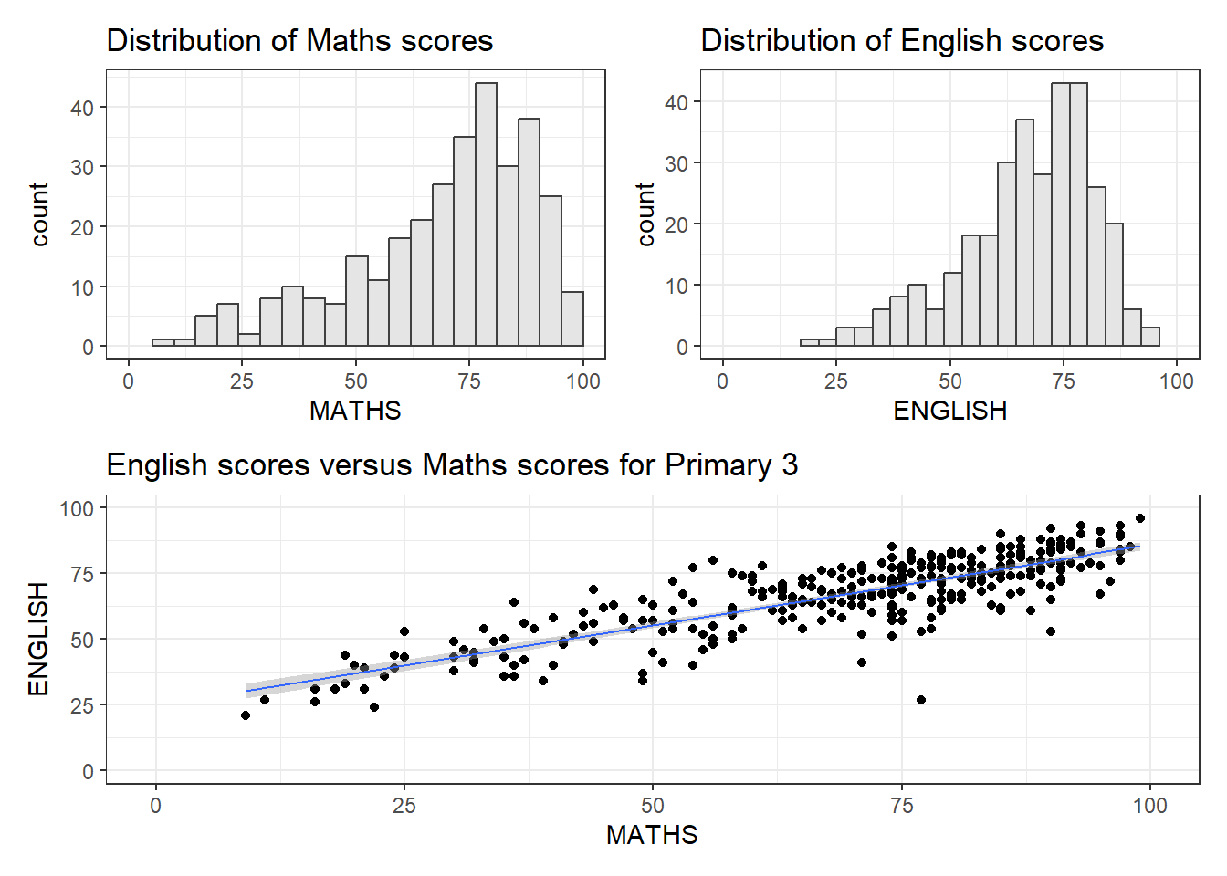
Additional attempt 5b:
patchwork <- (p1 / p2) | p3
patchwork & theme_bw() + theme(plot.title = element_text(size=8))
`geom_smooth()` using formula = 'y ~ x'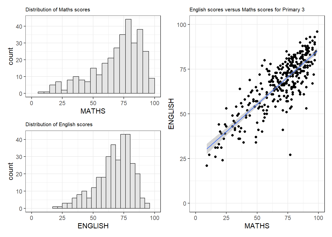
Suggested solution 1: increase figure size
patchwork <- (p1 / p2) | p3
patchwork & theme_bw()
`geom_smooth()` using formula = 'y ~ x'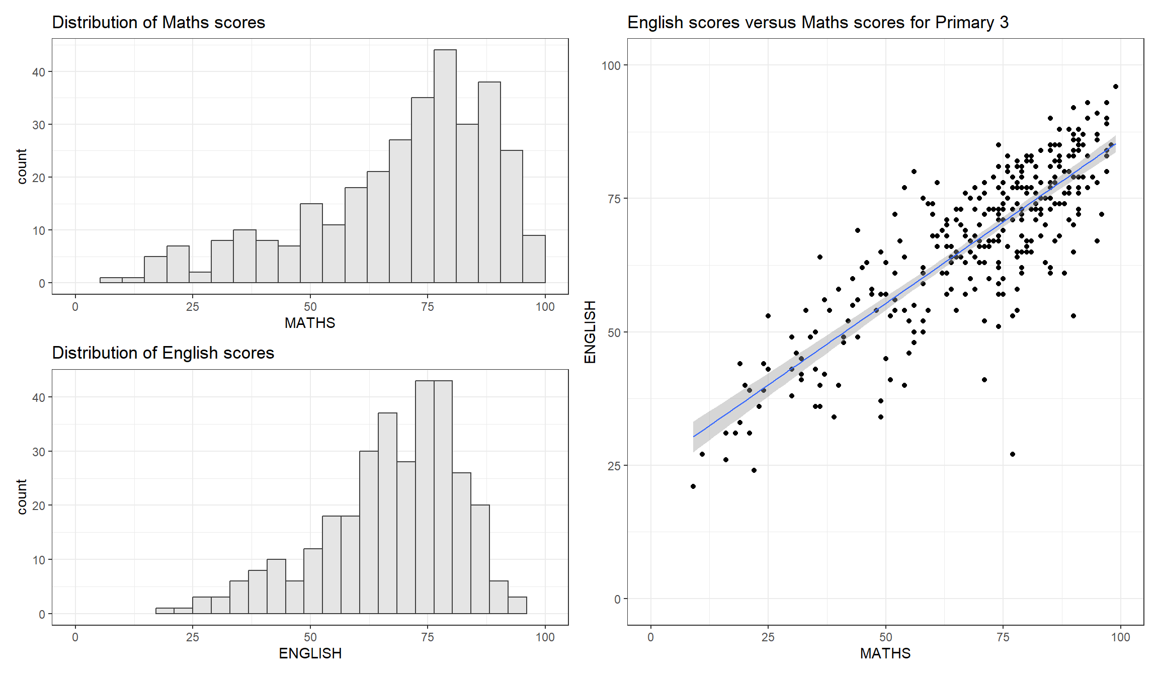
Suggested solution 2: Wrap text - divide text into 2 lines
Use stringr::str_wrap